Rise 360 · Microlearning · Camtasia
A 42-slide PowerPoint. A 90-minute session. An 87% quiz pass rate. Escalation rates hadn't moved in three years. The training wasn't the problem — the timing was.
The Suite
Each module is published as a standalone Rise 360 link — accessible by shared URL or QR code from a desk card, in under 10 seconds. That accessibility is not a technical detail. It is the central design decision of the entire project.
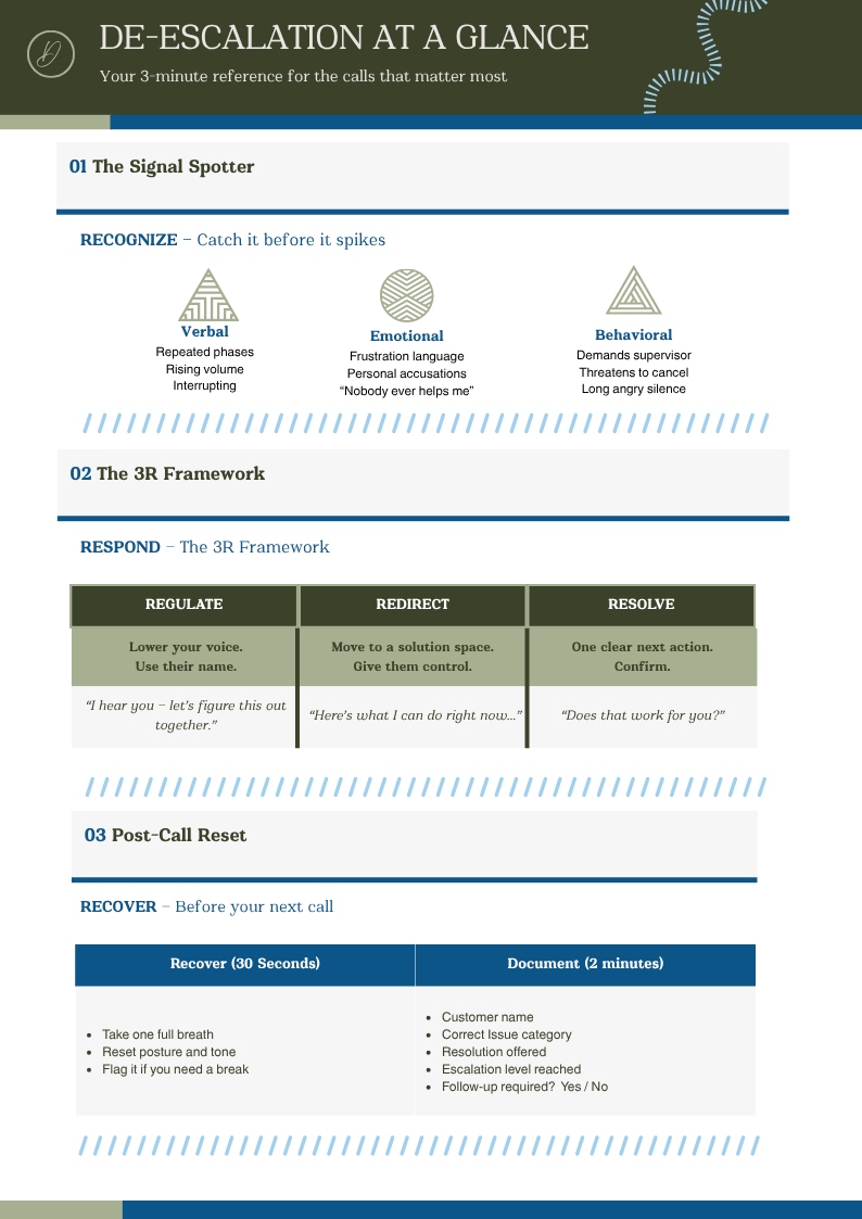
Recognize the Signals
Situational awareness · Calm, observational mindset · Labeled graphic interaction
Respond in the Moment
3R framework under pressure · Branching scenario · Fast, behavioral response
Recover and Document
Post-call recovery · Checklist interaction · Reflective, procedural mindset
Scan to launch the modules
Point your phone camera at this code for instant access — no LMS login required. This is the central design decision of the entire suite.
The Problem
ClearPath Contact Solutions had trained their agents thoroughly. A 42-slide PowerPoint deck, a 90-minute facilitated session, twice a year, with a 10-question quiz that 87% of agents passed. The training was real. The behavior change was not.
Escalation rates hadn't moved in three years. Supervisor intervention requests were up 31%. Agent turnover — frequently triggered by emotional exhaustion from unresolved difficult calls — remained the team's most persistent operational cost.
Agents didn't forget the de-escalation process because they weren't paying attention in the training. They forgot it because a 90-minute annual event is not accessible at 2:47 p.m. on a Tuesday when a customer is threatening to cancel.
This is not a knowledge gap. It is a moment-of-need gap. Knowing the difference — and designing for it — is the distinction between an instructional designer and a content builder.
Design Artifact
The companion Canva guide mirrors the three-module structure exactly — Recognize, Respond, Recover — so the visual layout reinforces the same mental model the modules build. Designed for a printed desk card, a digital Teams channel pin, and a desktop wallpaper.
Scan to view the guide
Instant access from any device
The Transformation
The "before/after" is the visual anchor of this case study. Content organization is a design decision, not an administrative one.
The Process
Before designing anything, I conducted a performance analysis to distinguish between two possible root causes:
Knowledge / Skill Gap
Solved by better training
Not the diagnosis here — agents passed the quiz.
Moment-of-Need Gap ★
Solved by performance support at the point of application
The data pointed clearly here.
This diagnosis drove the entire design direction: not a better course, but a different delivery model. Three short modules accessible by shared link — no LMS, no login, no scheduling. Available on demand, at the desk, in the moment before the next call.
The Process
I audited the original 42-slide PowerPoint and identified three cognitively distinct phases of the de-escalation process — each requiring a different mental state to execute. Each phase became one module. Content organization is a design decision, not an administrative one.
Before escalation — Recognize
Situational awareness and signal recognition. Required mental state: calm, observational. Rise block: Labeled Graphic for signal categories.
During escalation — Respond ★ Only branching moment in the suite
Executing the 3R response framework under pressure. Required mental state: fast, behavioral. Rise block: Process block + single branching decision point. Branching is used where it earns its complexity — not as a default structure.
After escalation — Recover
Recovery and documentation. Required mental state: reflective, procedural. Rise block: Checklist for post-call recovery steps.
The Process
Each module follows the same four-beat internal rhythm:
Hook
Immediate relevance — not a learning objective
Content
One concept, right Rise block type
Practice
One embedded check — not saved for the end
Bridge
Connects to next module, clear CTA
The Process
The companion infographic is a single-page vertical guide designed for three simultaneous use cases: a printed desk card, a digital Teams channel pin, and a desktop wallpaper.
Mirrors the modules
Same Recognize → Respond → Recover structure. Same sequence. Reinforces the same mental model.
QR code in footer
Links directly to Module 1. A single physical artifact that bridges the desk and the digital suite.
Decision tool, not reference
No regulation summaries. No policy text. Everything on the card is actionable in under 10 seconds.
The Process
The 90-second Camtasia walkthrough serves two audiences simultaneously: the call center agent who needs a quick orientation to the suite, and the hiring manager who needs evidence of video production capability.
The walkthrough follows the three-module arc, highlights the key design decisions — the scenario block in Module 2, the post-call checklist in Module 3, the QR code on the guide — and ends with a demonstration of the end-to-end workflow from desk card to live module.
Anticipated Impact
The metric I'd anchor to in a real deployment is supervisor escalation requests — it's objective, already tracked, and directly tied to the performance gap this suite was designed to close. Everything else is supporting evidence.
ID Theory
I want to name the theoretical framework driving this project explicitly — because naming your rationale is what separates an instructional designer from a content builder.
The concept of moment-of-need learning — associated with Bob Mosher and Conrad Gottfredson's Five Moments of Need framework — holds that different learning needs require different design responses:
First Time
Formal training
More
Formal training
Apply ★
Performance support
Solve ★
Performance support
Change
Performance support
The 42-slide PowerPoint was designed for the "first time" moment — then expected to serve the "apply" moment. That mismatch is why the training didn't transfer. This suite separates those two functions. The design is organized around when the learner needs it, not around what the content covers. That shift in design orientation is what microlearning, done well, actually means.
My Reflection
"If I were to iterate on this project, I would instrument the Rise modules to capture drop-off data by block — specifically to identify whether agents are completing Module 2's scenario interaction or skipping past it. If skip rates are high, that signals the scenario feels too long or too low-stakes for a 3-minute module, and I'd redesign it as a separate standalone microlesson. I would also explore adding a brief audio option to each module — a 60-second 'listen instead of read' alternative — because call center agents spend their entire shift in audio mode, and text-heavy learning may create unnecessary cognitive friction for that specific audience. Finally, I'd test whether making the QR code the primary entry point meaningfully changes completion rates — my hypothesis is yes, but I'd want the data."